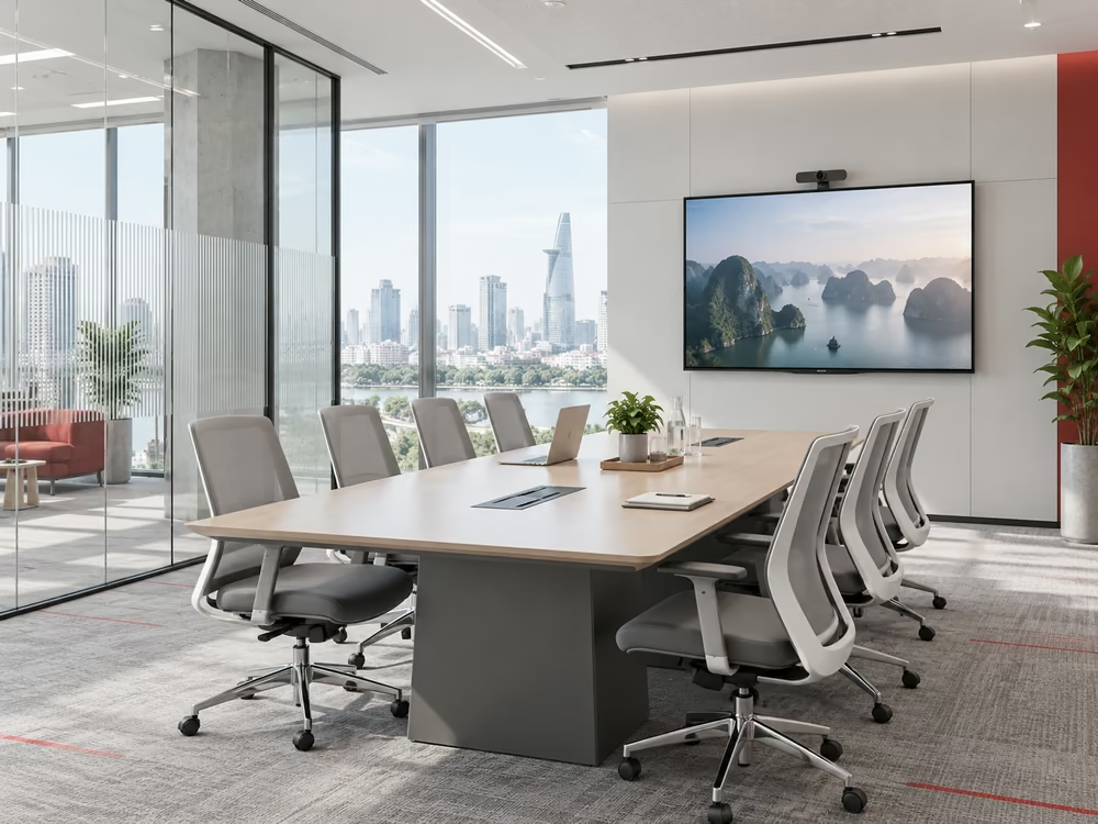
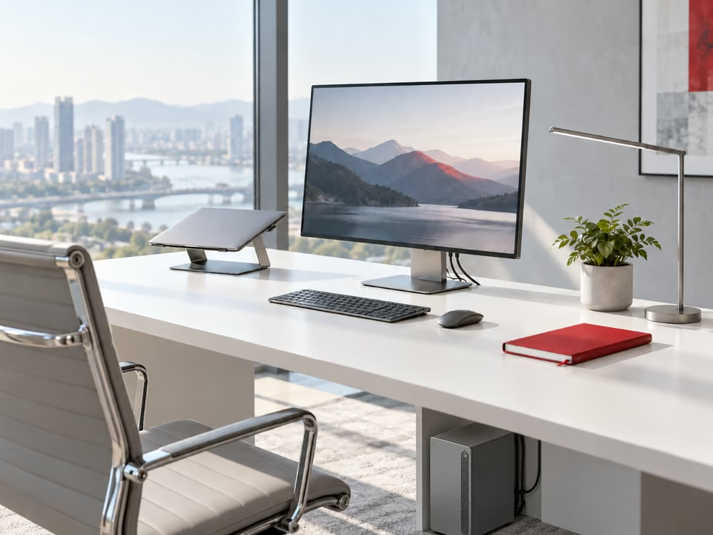
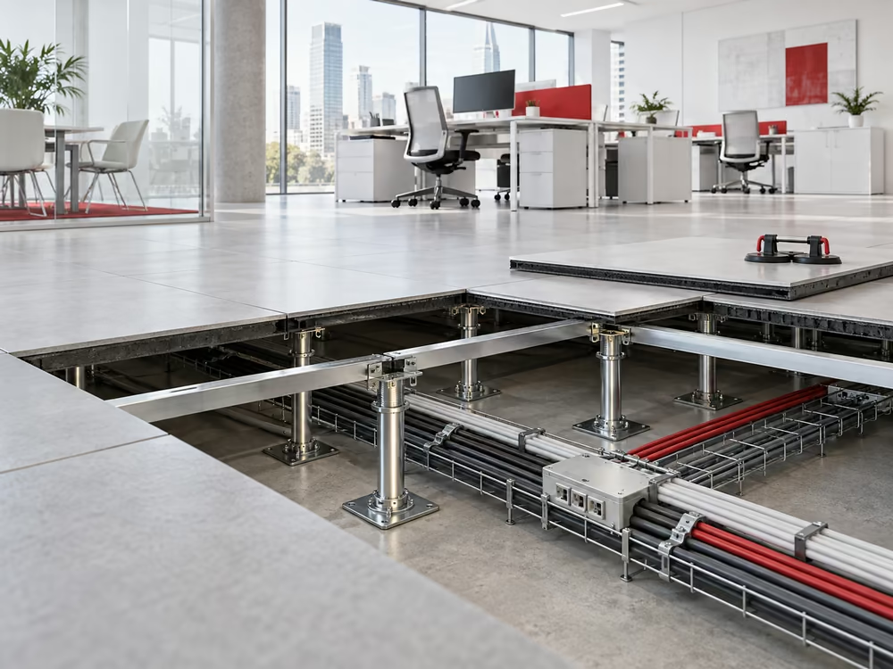
Color in the workplace directly affects how employees perceive space, maintain concentration, and distinguish between functional areas. An appropriate color palette should be determined based on floor area, lighting conditions, finishing materials, and the nature of the work rather than selected solely according to current trends.
This article presents common color coordination principles, the characteristics of frequently used colors, and the factors businesses should review before applying a palette to an office interior.
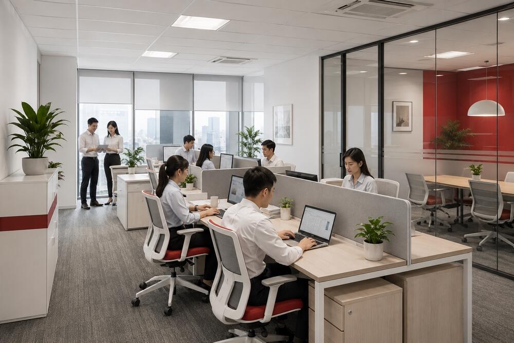
The Role of Color in the Workplace
Color establishes the overall visual context of an office. Within the same floor area, light tones generally make the space appear more open, while darker shades add depth but need to be balanced with natural light and artificial lighting.
Color palettes can also distinguish functional zones. Focused work areas often use neutral tones, meeting rooms may feature darker shades, and pantries or informal discussion areas can accommodate more noticeable accent colors.
For offices with an established brand identity, corporate colors should appear at selected locations such as the reception desk, main meeting room, signage, or specific interior details. Applying a highly saturated brand color across large surfaces may make the space feel visually heavy.
The 60–30–10 Color Rule
The 60–30–10 rule divides an office color palette into three groups according to their level of use:
- 60% dominant color
- 30% secondary color
- 10% accent color
The dominant color is generally applied to walls, ceilings, flooring, or other large surfaces. White, beige, light grey, and similar neutral shades are common choices because they coordinate easily with different materials and furniture.
The secondary color appears on desks, chairs, partitions, storage units, carpets, or selected walls. It should provide sufficient contrast with the background without competing with the primary visual accents.
Accent colors are used in smaller quantities on lounge chairs, artwork, signage, lighting fixtures, or branding details. In an RSQUARE Vietnam office, for example, the corporate red should be limited to selected focal points rather than distributed evenly throughout the space.
These proportions do not need to be calculated precisely by surface area. The main objective is to maintain a stable background color, a supporting color group, and a controlled amount of accent color.
Coordinating Four Functional Color Groups
Another approach is to divide the palette into four groups: base color, dominant color, secondary color, and accent color.
The base color forms the general background and is usually applied to ceilings, walls, or flooring. The dominant color defines the main design direction and occupies a significant part of the interior. Secondary colors connect different surfaces, materials, and functional areas. Accent colors appear only on elements that require attention.
This method is suitable for offices that use several materials, such as wood, metal, glass, carpet, and stone. Color should not be evaluated separately from material because the same shade will appear differently on glossy, matte, textured, or patterned surfaces.
When applying four color groups, businesses should review physical material samples under actual lighting conditions. Colors displayed on screens or small samples often differ from their appearance when installed across a large surface.
Analogous Color Coordination
An analogous palette uses colors positioned close to one another on the color wheel, such as blue and blue-green or beige and light brown. This approach creates smooth transitions between different areas and reduces visual fragmentation.
Analogous palettes are suitable for offices that require a consistent atmosphere with limited visual distractions. However, when all colors have similar brightness and saturation levels, the space may appear monotonous.
Variation can be introduced through materials, surface textures, or a small contrasting accent. For example, an office based on beige and light brown may incorporate black metal frames, indoor plants, or selected red details at the reception area.

Monochromatic Color Coordination
A monochromatic palette uses different shades and tones of a single color. A grey office, for instance, may combine light grey walls, medium-grey carpet, and darker grey chairs or partitions.
This approach creates visual consistency and suits minimalist interiors. Instead of introducing several additional colors, the design relies on variations in shade, material, and lighting to establish depth.
The primary risk is a lack of distinction between functional areas. Brand colors, natural wood, greenery, or metal elements can be introduced in limited quantities to create contrast.
Contrasting Color Coordination
A contrasting palette combines colors with clear visual differences, such as blue and orange, red and green, or black and white. Contrast is commonly applied in areas that require stronger identification, including reception spaces, main meeting rooms, or collaboration zones.
Contrasting colors should not occupy large portions of the entire floor. When several strong colors appear simultaneously, the primary visual focus becomes unclear and the office may feel cluttered.
A more controlled approach uses neutral colors as the background and introduces contrasting shades through chairs, decorative partitions, signage, or a selected feature wall. This method also makes future interior updates more manageable.
Characteristics of Common Office Colors
Each color creates a different impression, although the result also depends on its shade, the area covered, lighting conditions, and surrounding materials.
White
White reflects light effectively and is frequently applied to walls, ceilings, and storage systems. It is suitable for offices with limited floor area or restricted access to natural light.
When an entire office uses only white and flat surfaces, the space may feel cold or lack visual identity. Wood, carpet, plants, and warm neutral shades can be added to provide balance.
Grey
Grey is a common background color in contemporary offices because it coordinates easily with glass, metal, wood, and a wide range of brand colors. Light grey works well across large surfaces, while darker grey is often applied to carpets, chairs, or partitions.
The proportion of grey should be adjusted according to the lighting conditions. Offices with few windows or extensive dark-grey surfaces require an appropriate lighting system to avoid a heavy appearance.
Black
Black often appears on glass frames, table legs, lighting fixtures, handles, or other metal details. It creates defined lines and increases contrast against lighter surfaces.
Across large areas, black absorbs more light and may make the office appear smaller. It is therefore generally more suitable as a secondary or accent color than as the dominant background.
Blue
Blue is frequently used in workstations, meeting rooms, and spaces that require a stable visual atmosphere. Lighter blue tones create a softer impression, while navy produces a more formal appearance.
Combined with white and grey, blue suits a modern office style. When used extensively, the lighting color temperature should be reviewed to prevent the space from appearing excessively cold or blue-tinted.
Yellow
Yellow creates a noticeable focal point and is commonly applied in pantries, discussion areas, or movable furniture. Earthy yellow and mustard tones generally coordinate more easily with wood and neutral colors than bright yellow.
Due to its high visual intensity, yellow should be controlled by area. A small number of chairs, lighting fixtures, or decorative details is often sufficient to distinguish the space.
Red
Red attracts attention quickly and is suitable for signage, logos, reception counters, or selected interior details. It is also frequently used when red is part of the company’s brand identity.
Highly saturated red should not cover several walls or continuous work areas. White, grey, black, and light wood provide a suitable background for using red as a controlled focal point.
Factors to Review Before Selecting a Color Palette
Avoid Using Too Many Bright Colors
Several highly saturated colors placed together make it difficult to establish a primary visual focus. Businesses should identify one accent color and limit its use to selected areas or specific details.
Avoid Excessive Use of White
White increases the perceived size of an office but also makes dirt and surface wear more visible in high-traffic areas. Reception spaces, pantries, corridors, and printing zones require consideration of material durability, cleaning requirements, and color maintenance.
Balance Dark Colors with Lighting
Dark colors are appropriate for meeting rooms, reception areas, or details intended to create depth. However, offices with limited natural light should avoid extensive dark surfaces on walls, ceilings, and large storage units.
Include Flooring and Ceilings in the Overall Palette
Floors and ceilings cover substantial areas and directly affect the overall impression. Dark-grey carpet, black ceilings, and timber flooring should be included in the color proportion instead of evaluating only walls and furniture.
Do Not Select Colors Solely Based on Trends
A color or interior style that is popular at a particular time may not suit the lease term, business sector, or corporate identity. Offices with long-term leases should prioritize stable background colors, while trend-based elements can be introduced through movable furniture or details that are easier to replace.
Review Colors Under Actual Conditions
Color samples should be assessed under daylight and artificial lighting at different times of the day. Samples should also be placed next to the proposed carpet, wood, curtains, chairs, and other materials before construction begins.
Selecting Colors for Different Office Areas
Workstations should maintain a stable background palette and limit strong colors within employees’ direct field of vision. Meeting rooms may use darker tones to distinguish their function, provided that sufficient lighting is maintained for both in-person and online meetings.
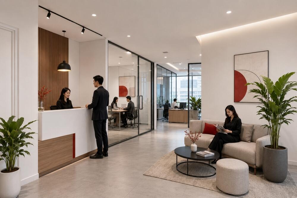
The reception area is an appropriate location for applying brand colors to the logo, reception counter, or main feature wall. Pantries and collaboration areas can use a more flexible palette because these spaces are intended for short discussions, breaks, and internal activities.
In offices with multiple departments, color can also form part of the wayfinding system. Each area may use a small identifying color on room signs, glass partitions, or furniture, while the general background palette remains consistent across the floor.
Conclusion
An office color palette should be developed together with the layout, lighting plan, material selection, and corporate identity. The 60–30–10 rule provides a practical structure, while analogous, monochromatic, or contrasting approaches can be selected according to the function of each area.
Before final approval, businesses should review color samples at the actual premises and compare them with the proposed finishing materials. This process reduces differences between design renderings and the completed office, particularly for colors strongly affected by lighting and surface area.